Ergostyle
Brand Refresh
Logo Design / Brand Development
There’s a lot more to a workspace than tables, chairs and partitions. With an understanding of how people use workspaces and a dedication to innovative ergonomic technology, Ergostyle has
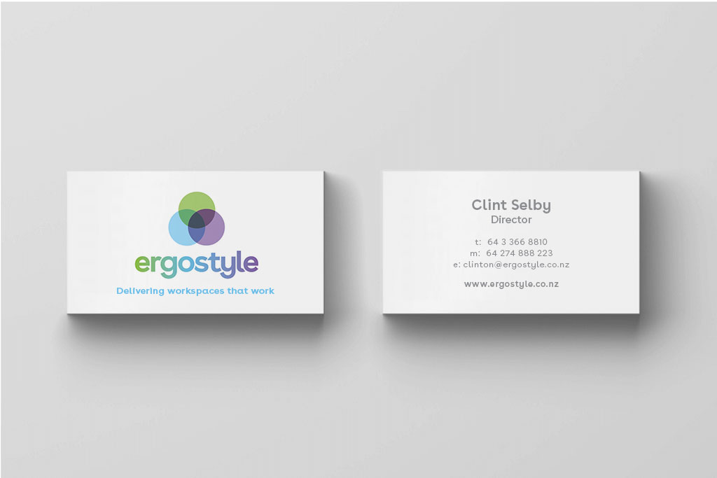
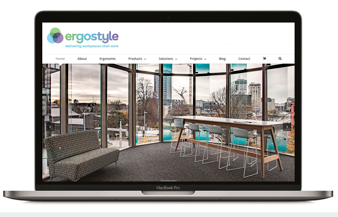
They were after a brand refresh so we went to work designing a new logo and defining their purpose, values and brand promise. The final logo comprised of three overlapping circles representing the holistic approach they take to every job. The circles also represent their values, green is empathy, blue is expertise and purple is empowerment. It is this approach that sets them apart from their competitors.
.
“Our purpose is to design and deliver stylish workplaces for optimal productivity and wellbeing”